Hierarchy in Design: Organizing Elements for Clear Communication
Discover the art of visual hierarchy in design and learn to masterfully direct the audience's attention to create intuitive, impactful, and effective designs.

3 min read
·November 19, 2023
Introduction:
In the grand theater of graphic design, hierarchy plays the lead role, directing the audience’s attention to where it’s most needed. It’s the tool that organizes the chaos, ensuring that the most crucial elements take center stage while the supporting cast enhances the story without stealing the show. Let’s spotlight this key design principle and learn how to apply it effectively in our visual narratives.
The Command of Hierarchy:
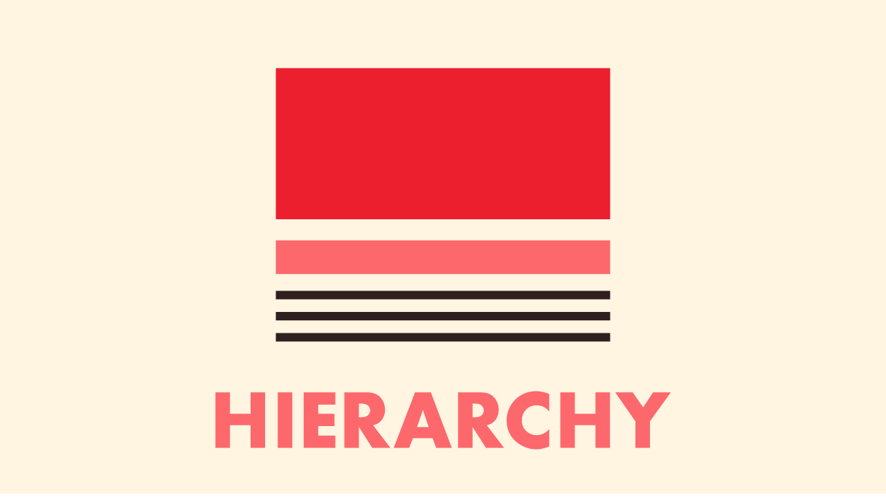
Hierarchy is all about the order of importance within a design. It’s a visual GPS that guides the viewer through the content, ensuring they arrive at the intended destination without unnecessary detours. Here’s how I direct the show with hierarchy:
- Size Matters:
- The larger an element, the more attention it grabs. Headlines dominate over subheadings, and subheadings over body text, creating a clear order of reading.
- Color Cues:
- Bright and bold colors can shout for attention, while muted tones whisper. Using color strategically can highlight key areas and signal their rank in the visual pecking order.
- Typographic Treatment:
- A change in font or style—bold, italic, uppercase—can signal a shift in importance, making typographic hierarchy a designer’s vocal range.
- Spacing for Emphasis:
- Ample space around an item can elevate its status, much like a pedestal for a sculpture. This isolation can create a focal point and elevate an element’s rank.
- Alignment and Layout:
- A well-thought-out alignment and structured layout can steer the eye naturally through the levels of information, ensuring a smooth and logical visual journey.
Deploying Hierarchy in Design:
Imagine a poster without hierarchy; it’s like an orchestra without a conductor—sure, you’ll hear the music, but it lacks direction and harmony. Recently, I designed a festival poster where the event name reigned supreme at the top, the headlining bands were next in the hierarchy, and the smaller details followed in an orderly fashion, all harmoniously playing their part.
A Personal Insight on Hierarchy:
To me, hierarchy isn’t just organization; it’s storytelling. It’s about creating a visual rhythm that leads the viewer through the narrative, from the gripping headline to the fine print at the story’s end.
Conclusion:
Embracing hierarchy means becoming the director of your audience’s gaze, using size, color, typography, and space to orchestrate a seamless experience. Whether it’s a business card, a website, or a billboard, a well-hierarchized design is intuitive, impactful, and undeniably effective.
So, fellow designers, let’s not flatten our stages. Instead, let’s build them with intention, crafting a visual hierarchy that elevates our message and delivers it with the clarity and emphasis it deserves. Here’s to the designs that don’t just display content but truly communicate, one level at a time.
Similar Posts
-
November 19, 2023
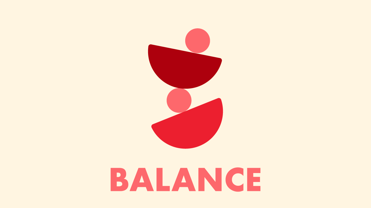
Discover the art of balance in design, exploring its types and impact on transforming good designs into great ones in this insightful blog post.
-
November 19, 2023
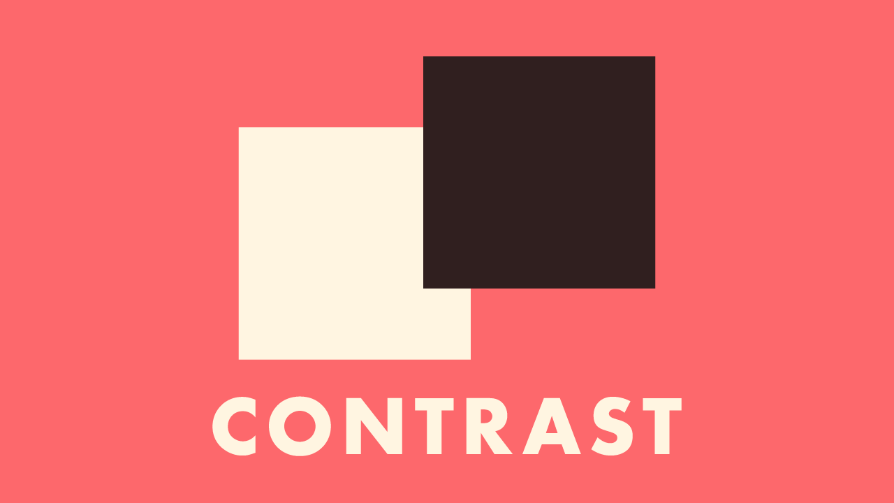
Delve into the transformative role of contrast in design, from color to typography, and learn to create designs that are both compelling and memorable.