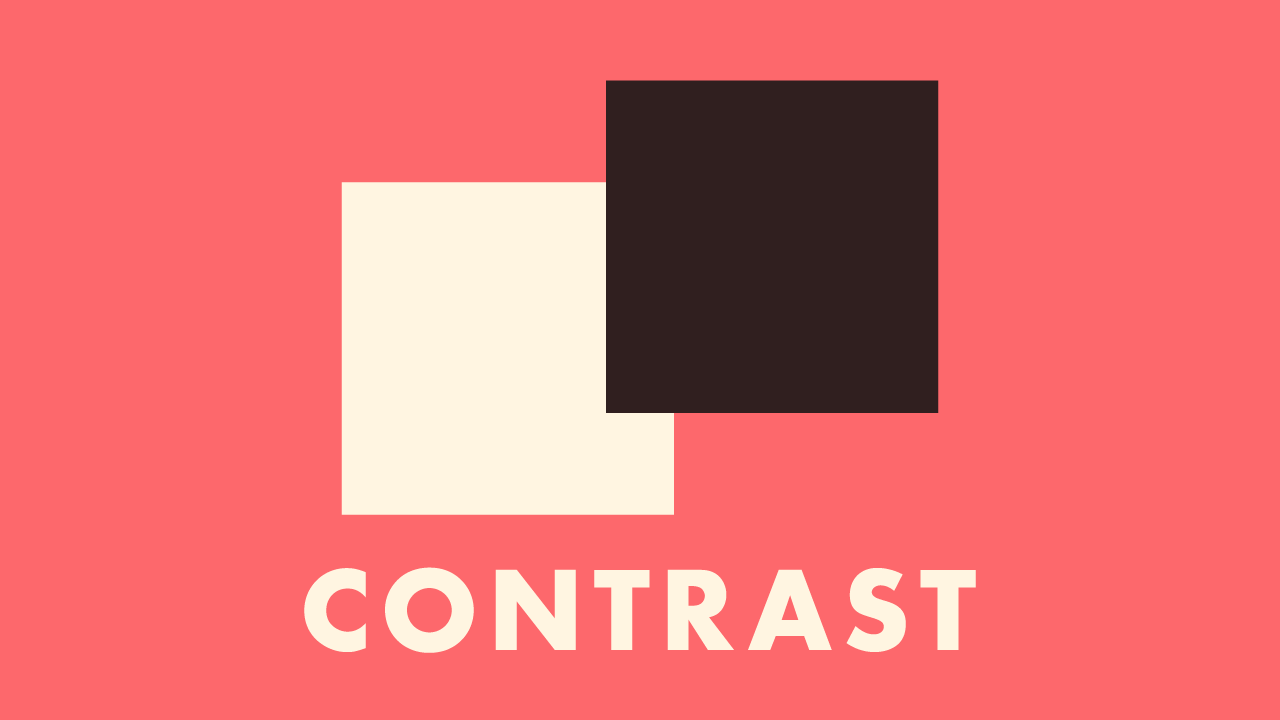
Contrast in Design: Highlighting with Oppositional Elements
Delve into the transformative role of contrast in design, from color to typography, and learn to create designs that are both compelling and memorable.

3 min read
·November 19, 2023
Introduction:
In my design odyssey, I’ve recognized that contrast is more than just a principle; it’s a storyteller. It’s the bold voice in a world of whispers, the splash of color on a monochrome canvas, the beacon that draws the eye and commands attention. Today, let’s unwrap the layers of contrast and explore how it shapes our perception of design.
Understanding Contrast:
At its core, contrast is the juxtaposition of opposing elements. It’s black against white, large against small, round against angular. But contrast extends beyond the visual; it’s the play of textures, the dance of typography, and the dialogue between space and form. Here are the ways I harness contrast in my work:
- Color Contrast:
- Color is often the first thing that catches the viewer’s eye. I use color contrast to create focus points, highlight important elements, and guide the viewer’s journey through the design. The classic black-on-white is a stark contrast, but so is a vibrant red on a serene blue.
- Size Contrast:
- By varying the size of elements, I can imbue my designs with hierarchy and emphasis. A headline in bold, large font towering over a delicate subtext tells you what’s important without uttering a word.
- Shape Contrast:
- I love to play with geometric and organic shapes to draw interest and movement. The rigid lines of a square paired with the curves of a circle can create a dynamic that’s both engaging and visually stimulating.
- Texture Contrast:
- The illusion of texture in a flat image can be a delight to the senses. The smoothness of a brushed metal effect against the roughness of a grunge background can evoke emotions and add depth to the flat surface of a screen or page.
- Typographic Contrast:
- Mixing and matching typefaces is a delicate art. The elegance of a serif font meets the simplicity of sans-serif, and in their meeting, they create an interplay that can make text leap off the page.
Contrast in Action:
I’ve found that contrast is not about using opposites for the sake of it. It’s about creating meaning and directing focus. For instance, in a poster for a tech event, I might opt for a bold, futuristic font against a backdrop of traditional tech imagery to signify the cutting-edge nature of the event.
My Perspective:
I view contrast as the spice of the design dish. Without it, our designs risk falling flat, lacking dimension and clarity. It’s with contrast that we tell the viewer what to feel, what to think, and where to go next. It is the guiding light in the visual narrative we weave.
Conclusion:
As we navigate the vast seas of design, let us not shy away from the shores of contrast. Instead, we should embrace it, using it to define, enhance, and empower our visual statements. Contrast is the key to clarity, the creator of interest, and the bringer of vitality to a composition.
So the next time you’re in front of a blank canvas, ask yourself: where can contrast take this design? The answer might just be the difference between good and unforgettable.
Here’s to the bold, the beautiful, the contrasted designs that stay etched in memory long after the first glance. May your designs always pop with the power of contrast.
Similar Posts
-
November 19, 2023
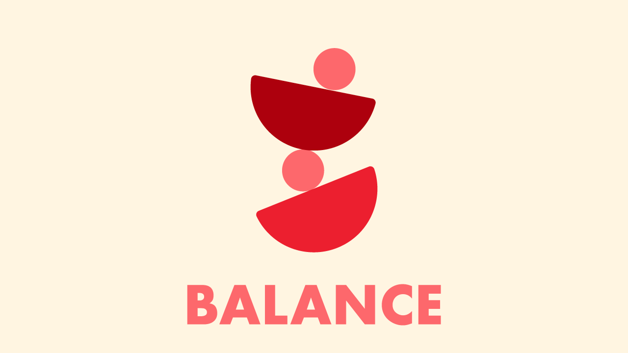
Discover the art of balance in design, exploring its types and impact on transforming good designs into great ones in this insightful blog post.
-
November 19, 2023
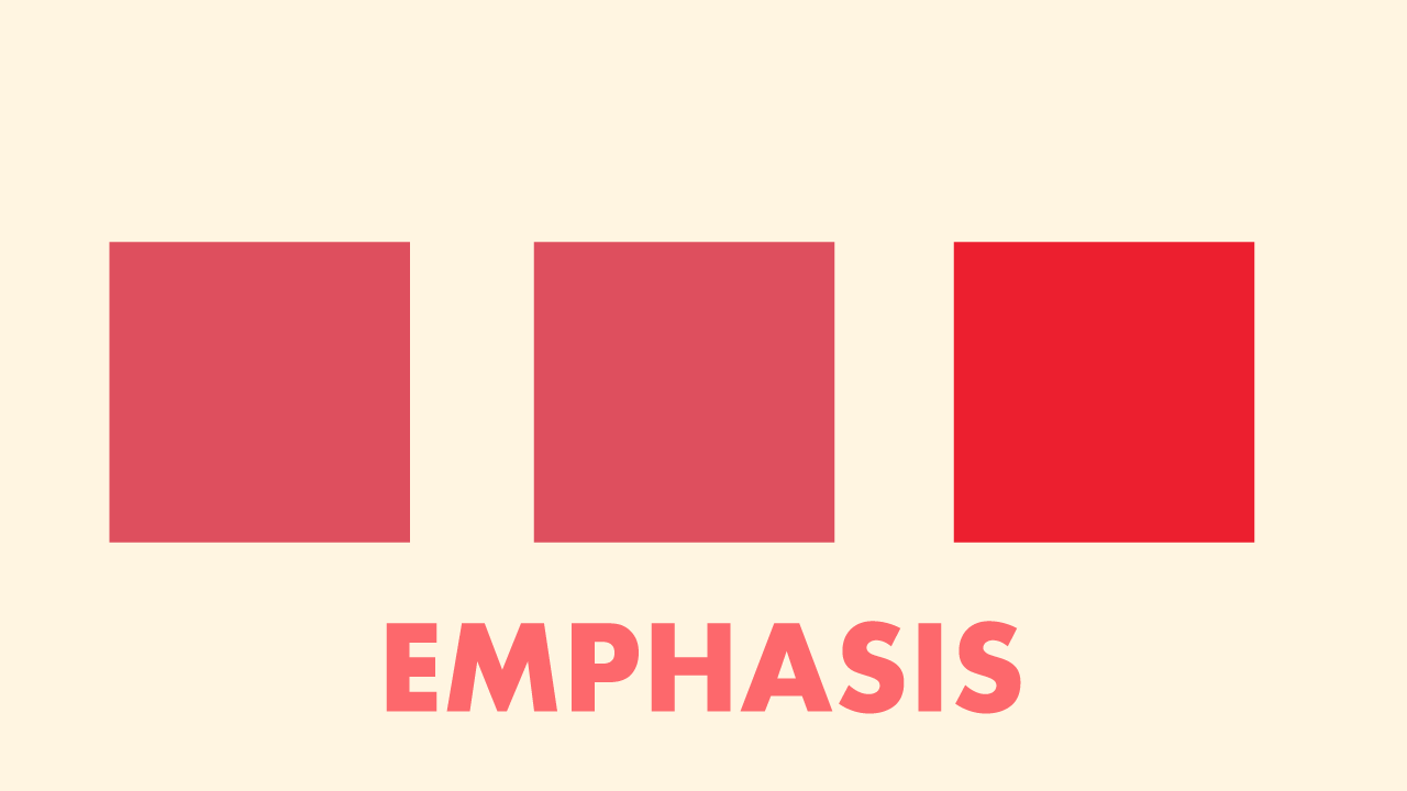
Discover how the emphasis in design guides attention and transforms visuals into captivating stories, ideal for designers looking to refine their skills.