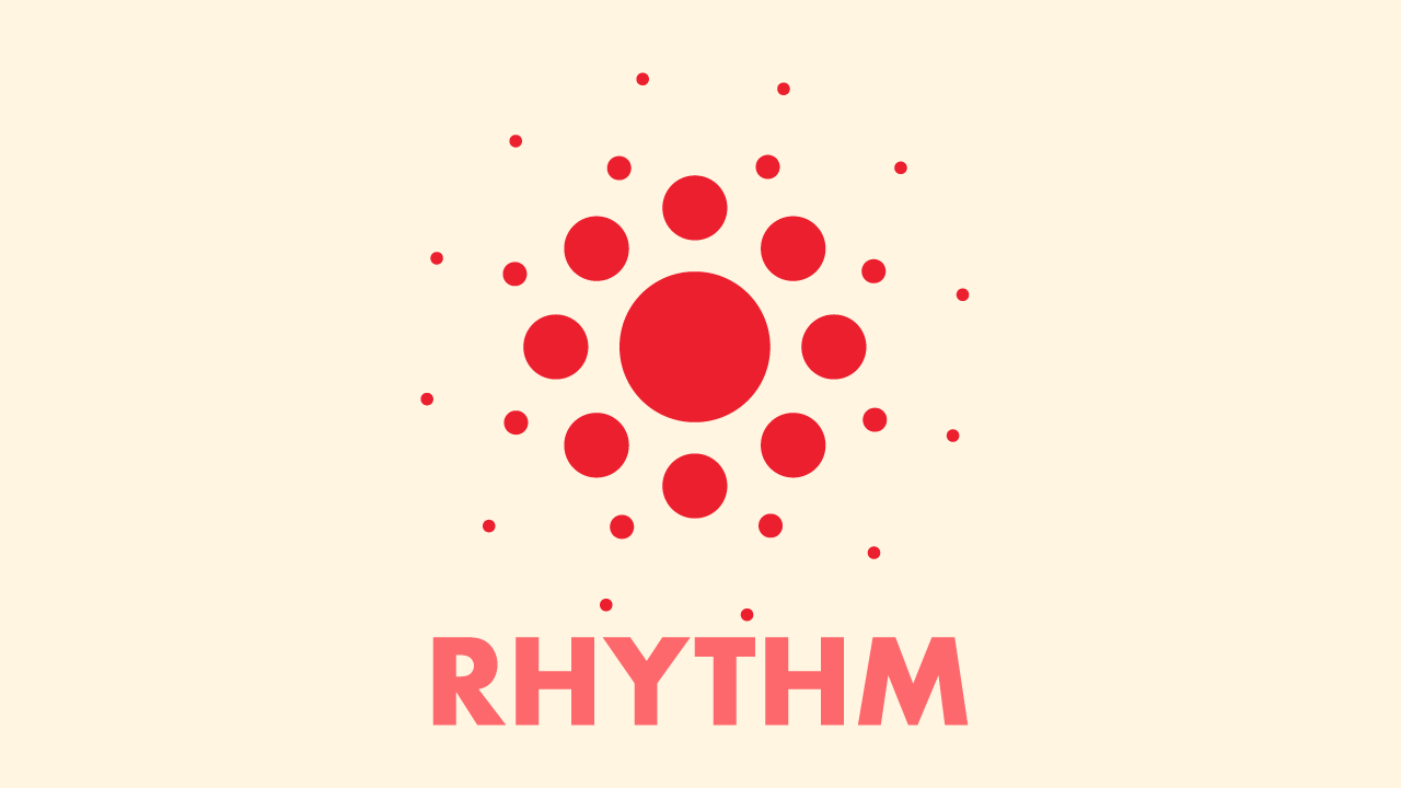
Rhythm in Design: Establishing a Visual Beat
Discover rhythm in graphic design, a key principle that organizes content and guides the viewer, creating designs that are both seen and felt.

2 min read
·November 19, 2023
Introduction:
Just as in music, rhythm in graphic design orchestrates a pattern of visual elements that propel a viewer’s eye across the page. It’s the silent tempo that commands attention and organizes content in a dance of symmetry and surprise. Today, let’s step into the rhythm that pulsates beneath the surface of standout designs.
Decoding Rhythm in Visual Terms:
In the realm of design, rhythm is about creating predictable patterns and sequences that establish a visual cadence. Here’s how I harness rhythm to make designs not just seen, but felt:
- Repetition and Interval:
- Like the steady drumbeat that sets the pace for a song, repetition and the spaces in between—intervals—set the pace for how a design is consumed.
- Progression and Flow:
- Rhythm can be a gradual increase or decrease in size, a transition in color, or a sequence of a graphic element that leads the eye. It’s about crafting a journey on a canvas.
- Alternation and Contrast:
- Alternating between different elements or contrasting them can create a visual rhythm that adds interest and dynamics to a piece, preventing monotony.
Rhythm in Practice:
Consider a website design: Headers lead into content, images alternate with blocks of text, buttons call for action—each follows a rhythm that guides the user’s experience, creating a path of least resistance through the information.
A Personal Note on Rhythm:
To me, rhythm is the heartbeat of a design. It’s an invisible guide that ensures everything works together, like dancers flawlessly in sync. When rhythm is right, the design feels intuitive, and viewers move through it with a sense of harmony and purpose.
Conclusion:
Embrace rhythm as the choreographer of your content, allowing each visual element to take its cue and perform in time. Whether it’s through consistent headers, a color scheme that leads the eye, or the strategic use of white space, let the rhythm in your designs move your audience.
So, my fellow designers, let’s compose with visual beats and create designs that not only catch the eye but also resonate with the viewer’s internal rhythm. Here’s to the creations that not only look good but feel right—those are the designs that truly move people.
Similar Posts
-
November 19, 2023
Discover the art of balance in design, exploring its types and impact on transforming good designs into great ones in this insightful blog post.
-
November 19, 2023
Delve into the transformative role of contrast in design, from color to typography, and learn to create designs that are both compelling and memorable.